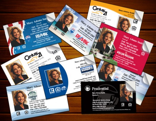
Some people spend a lot of time designing their real estate business cards. They carefully select the right photo, the right color scheme, they agonize over whether to use dots or dashes in their phone number. Other people throw their information into a standard template and call it a day.
Very few people think about what should go on the back of their business card. If you’re one of those people, you’re missing out on a real opportunity to set yourself apart. Unlike the front side of a business card, which needs to contain pretty much the same information for everyone, the back of a business card lets you highlight what’s most important to your marketing. Here are a couple of DOs and DON’Ts for making the most of the space:
- DO grab attention. Bold images and simple fonts will draw your prospect’s eye. Choose a single color for the background, whether that’s a bright color that contrasts with the front of the card, or a lot of white space to help your message stand out.
- DO stay focused. Resist the temptation to turn your business card into a mini brochure, listing everything you can do for clients. Instead, highlight a very specific benefit to prospects: Ask them to visit your real estate blog for great advice on selling a home, tell them to check you out on Pinterest for up-to-the minute listings with lots of pictures, or feature a benefit statement that shows why you should get their business.
- DO keep it personal. Remember, a business card isn’t an advertisement. It’s a reminder of a personal connection. The back of your business card should focus on reinforcing that connection, not just trying to make a sale.
- DON’T overcrowd. The front of your business card has plenty of information. The back should stay focused on a single, specific idea. It should be easy to tell the two apart.
With a little bit of care and attention, the back of your real estate business cards can be a great asset. The next time you’re ordering a new set of cards, keep these tips in mind to create a standout back for your business card.
